Bringg
analytics

Explore our tailored services
designed to elevate your brand.

Role: UX , UI, Research, Product.

Platform: SaaS (B2B)

2019-Present

Background

01

chALLENGES

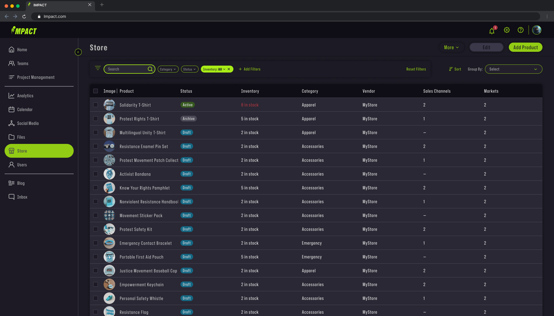
Dashboard Builder: Empowering Clients with Analytics Self-Service

Overview

Aligning with Bringg's strategic shift toward client "Self-Service," our analytics team developed a powerful new feature designed to reduce operational overhead across multiple departments including Customer Success, Professional Services, Support, and Development maintenance.

Primary Pain Point

Our legacy dashboard architecture contained approximately 60 widgets and 40 distinct metrics, with certain metrics appearing across multiple visualizations. Each widget functioned as an isolated "box" with predefined settings, visuals, and metrics established by our team. This rigid approach generated significant maintenance costs and created friction points for clients across multiple touchpoints including Development, Customer Success, Professional Services, and Support teams.

Goal

Extend user engagement duration within the dashboard environment by at least 20%, driving deeper analytical insights and increased platform stickiness.

Overview

  1. Leverage our existing widget catalog infrastructure as the foundation for this feature.
  2. Comprehensively map all available widgets and metrics for seamless discovery.
  3. Design with scalability in mind to accommodate future growth.
  4. Ensure intuitive usability with a minimal learning curve for end users.

How we worked

02

Process

Keeping our clients satisfied based on great discovery, top notch team work and fine ux.

Discovery and
UX RESEARCH

We enhance user experiences through intuitive UI/UX design, ensuring seamless interactions that delight users and meet your business objectives.

Market Research & Personas Development

Our research focused on two key elements: Market research & Persona Research. After a detailed discovery we concluded that those 2 main key element are essentials for leading the design process.

Market Research focused on user flow and complexity of widget configuration in systems such as: Monday, Jira, Microsoft Bi and more.

Persona Development focused on the main users that will mainly use the feature which are on our case System Operation managers.

Wireframing

Before i started the wireframing process, i kept in mind that this feature is one peace in a huge eco-system. Therefore the wireframing was partially based on other features in the eco-system to reduce friction and frustration to the user and reduce developing cost to the company.

Overview

  1. Leverage our existing widget catalog infrastructure as the foundation for this feature.
  2. Comprehensively map all available widgets and metrics for seamless discovery.
  3. Design with scalability in mind to accommodate future growth.
  4. Ensure intuitive usability with a minimal learning curve for end users.

VISUAL COMPASS

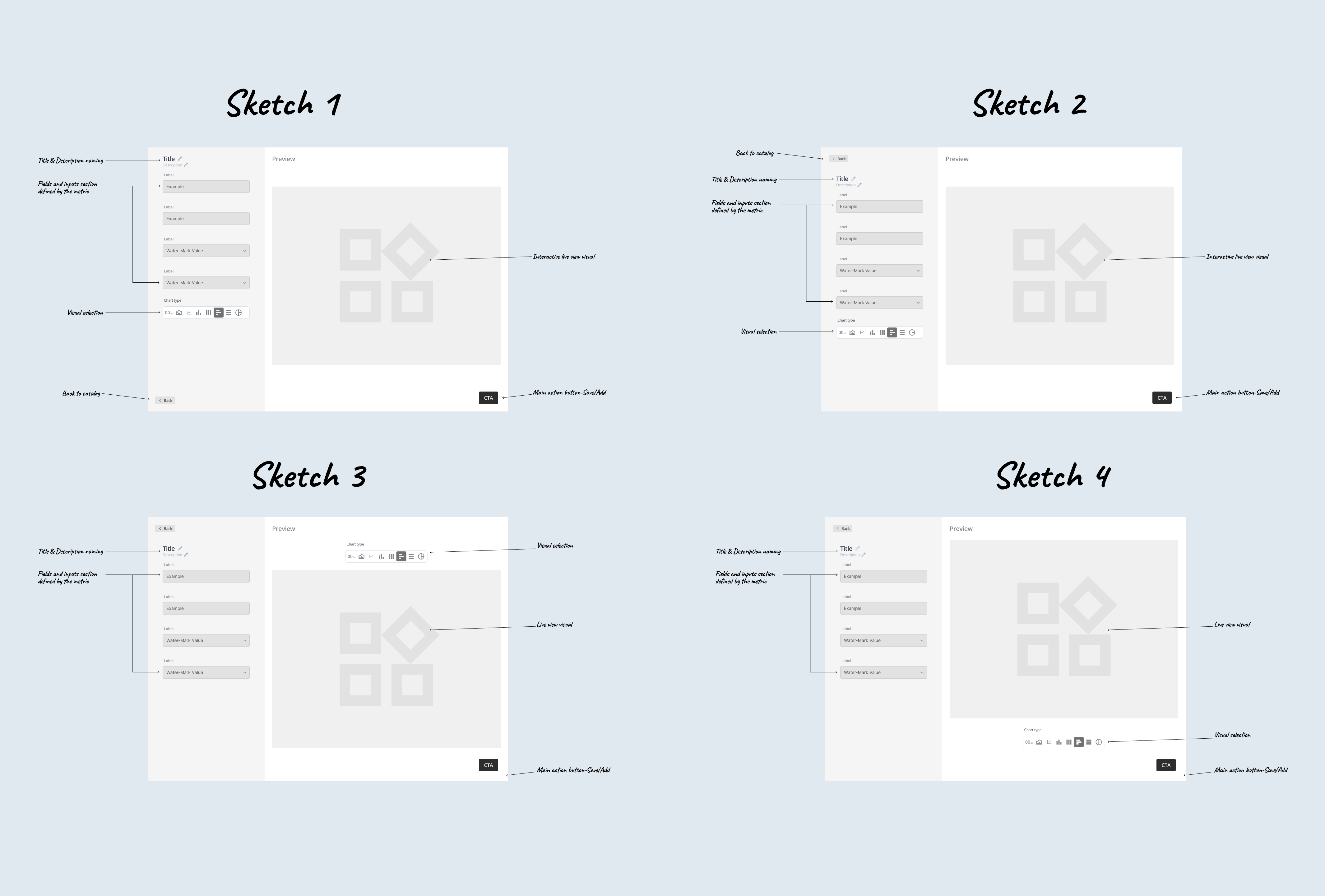
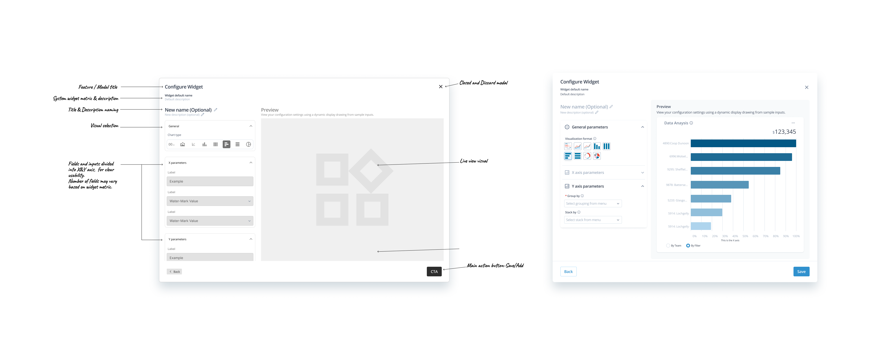
Crafted to deliver intuitive data interactions with minimal learning curve, empowering users to effortlessly navigate complex analytics.

Temporal Analysis

Our visualization simplifies pattern discovery with a beginner-friendly interface that evolves with user expertise. The clear visual hierarchy guides users from basic time comparisons to advanced trend analysis without overwhelming them. Progressive tooltips appear contextually during initial interactions, then fade as users demonstrate mastery, creating an interface that feels instantly familiar yet reveals depth through continued engagement.

Streamlined Customization

We've designed an adaptive configuration experience that eliminates the frustration of complex setup processes. The interface introduces functionality gradually, surfacing basic options first while more advanced controls appear only when relevant. This scaffolded approach creates confidence through early success, encouraging exploration while preventing the anxiety that typically accompanies feature-rich analytical tools.

Horizontal Comparison

This visualization transforms comparative analysis into an intuitive experience through thoughtful information architecture. Elements are arranged to follow natural visual scanning patterns, reducing the cognitive load typically associated with multi-metric comparisons. New users gain immediate value through default views while discovering additional functionality through subtle interactive cues, creating a discovery process that feels rewarding rather than overwhelming.

Result

03

final design

The outcome of great collaboration between Product Manager, Professional Writer, Teach Lead & UX

The Numbers

04

KPI

Data analysis and numbers after rolling out the feature

ENGAGEMENT duration

Before

00:16:38

after

00:28:17

INCREASE

56.7%  increase in engagement time.
The team increased the duration time in BI Dashboard in 3 months by 11:39 minutes.

USER ADOPTION

Before

60-50 users

after

120-100 users

INCREASE

150%  increase in user adoptions over 3 months, showing promising user adoption with room for continued growth.

impact

View work

bringg
optimization

View work

Project#?

Project#?